Carat — The Dark Luxury Shopify Theme Built for Jewelry Brands
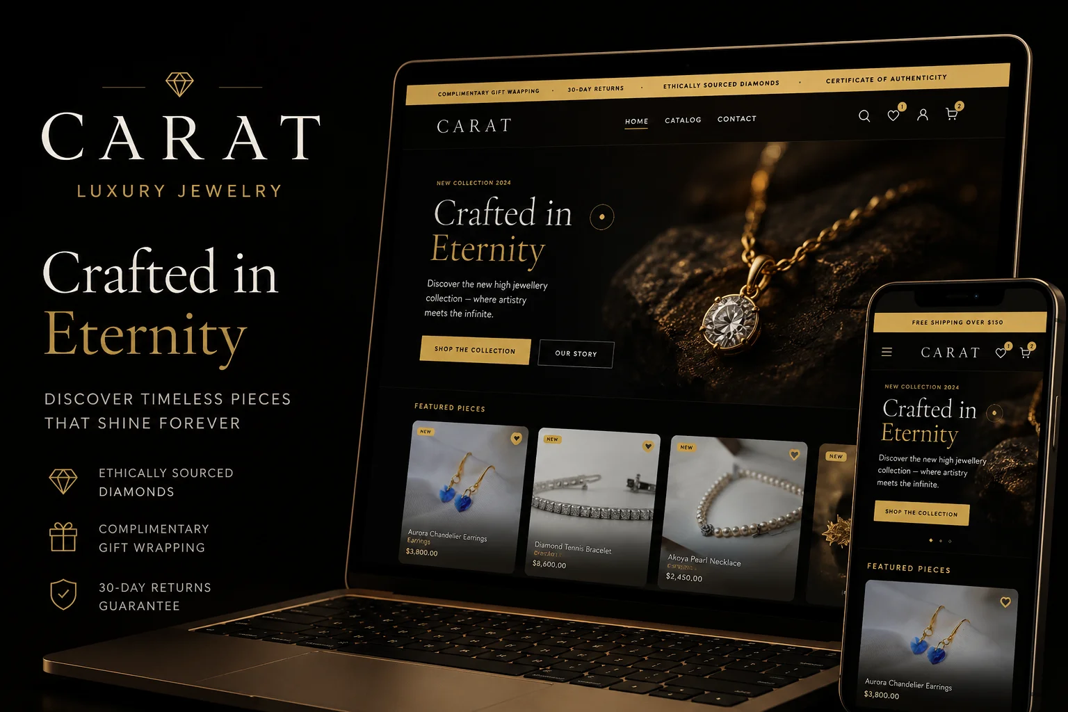
Carat is a premium dark luxury Shopify theme built for jewelry brands, fine accessories, and luxury retail. Obsidian background, gold accents, Cormorant Garamond typography — Cartier-level aesthetic without the custom build cost.
Most Shopify Jewelry Stores Look Like They Were Built in 2018
White background. Generic serif font. Standard product grid. The same Shopify jewelry theme layout used by a thousand other stores selling completely unrelated products.
Jewelry is not a generic product category. It's one of the most emotionally charged purchases a customer makes — engagement rings, anniversary gifts, personal milestones. The store that sells it needs to communicate desire, exclusivity, and craftsmanship before a customer reads a single word of copy.
Carat was built for exactly this. A dark luxury Shopify theme designed from the ground up for jewelry brands, fine accessories, and premium retail. The same visual language used by Cartier, Dior, and Tiffany — available as a Shopify theme you can launch in days.
The Design System Behind Carat
Every element in Carat exists to make jewelry look extraordinary. The design system is built around three principles: darkness creates desire, gold communicates value, and space lets the product breathe.
Obsidian Background — #0d0d0d
Not pure black. Obsidian — a deep, rich darkness that makes diamonds, gold, and gemstones explode off the screen. Pure black is harsh. Obsidian is atmospheric. The difference is subtle in screenshots and immediately apparent when you're standing in front of a display ring on the right background.
Cartier's website uses dark backgrounds on product pages for exactly this reason. The product becomes the only light source on the page. Customer attention goes exactly where you want it — to the jewelry.
Soft Gold Accent — #c9a84c
Not yellow gold. Soft gold — the kind of warm, aged, champagne tone you see on luxury packaging from Paris and Milan. It communicates premium without being ostentatious. Used for call-to-action buttons, price displays, hover states, and decorative elements that guide the customer's eye through the page.
Cormorant Garamond Typography
The display typeface choice defines a brand's personality before customers process the actual words. Carat uses Cormorant Garamond — the same typographic family used by luxury fashion houses and fine jewelry brands worldwide. It communicates heritage, craftsmanship, and refinement in a way that no sans-serif font can replicate.
Body copy uses Jost — clean, readable, contemporary. The pairing creates the tension between heritage and modernity that defines the best luxury brands.
25+ Sections Built for Luxury Retail
Carat ships with more than 25 purpose-built sections — not generic blocks repurposed from a multipurpose theme. Every section was designed with a specific role in the jewelry customer journey.
Cinematic Hero — Full-viewport opening statement. Parallax-enabled background, editorial headline treatment, and a single call-to-action. The kind of first impression that makes customers feel they've arrived somewhere special.
Editorial Split — Half image, half story. Perfect for introducing a new collection with the photography and the narrative together — the way luxury print campaigns work.
Product Spotlight — A single hero product presented with the attention it deserves. Large photography, detailed description, material callouts, and the add-to-cart in a layout that says "this piece is extraordinary."
Lookbook Template — Full editorial campaigns presented as a visual story. Campaign photography, lookbook images, and shoppable product links in a layout that resembles a luxury print editorial.
Press Mentions — Social proof through media coverage. Vogue, Harper's Bazaar, Business of Fashion — if you have press coverage, Carat gives it the prominence it deserves.
Brand Story — The section where you communicate heritage, craftsmanship, and the reason your jewelry exists. Luxury buyers buy stories as much as they buy products.
Video Section — Autoplay or click-to-play video that brings the jewelry to life. Campaign films, atelier footage, craftsmanship process videos — the format that converts better than any static image.
Cinematic Animations — Motion That Communicates Luxury
Carat's animation system communicates premium before customers consciously notice it. Four animation types work together to create a pacing that feels editorial, not promotional:
ScrollReveal — Elements reveal as the customer scrolls, with timing calibrated for luxury pacing. Not instant, not delayed — the precise speed that makes content feel curated rather than loaded.
Parallax — Background images move at a different speed to foreground content. The depth effect creates cinematic richness that flat layouts can't achieve.
Magnetic Cursor — Interactive elements attract the cursor slightly as it approaches. A micro-interaction so subtle most customers won't consciously notice it — but it makes the experience feel more alive, more considered.
Gold Glow — The gold accent colour emits a soft glow on hover states and featured elements. It communicates warmth and value in a way that standard colour changes don't.
All animations respect prefers-reduced-motion — customers who have set this system preference receive a clean, motion-free experience automatically.
Who Carat Is Built For
Fine jewelry brands — Engagement rings, wedding bands, diamond jewelry, gold and silver pieces. Carat's dark luxury aesthetic positions fine jewelry as the premium purchase it is.
Luxury accessories brands — Watches, leather goods, sunglasses, premium scarves. Any accessory category where the brand competes on craftsmanship and heritage rather than price.
Independent jewelers going online — If you've spent years building a physical presence that communicates luxury, Carat ensures your online store matches that standard rather than undermining it.
Gemstone and crystal retailers — The dark background makes coloured gemstones — sapphires, emeralds, rubies, amethysts — photograph and display with maximum vibrancy.
Luxury gifting brands — Any product positioned as a luxury gift — keepsake boxes, heirloom pieces, bespoke items — benefits from the Carat aesthetic that communicates "this is worth the price."
Carat vs Prestige — The Most Searched Shopify Jewelry Theme Comparison
Prestige is the most commonly compared Shopify theme for jewelry and luxury stores. It costs $380 and is widely used. Here's the honest comparison:
Prestige strengths: Longer track record, larger support team, more reviews, proven across thousands of stores.
Carat advantages: Built specifically for jewelry (Prestige is a general luxury theme), dark obsidian palette designed for how jewelry actually photographs, Cormorant Garamond typography that matches fine jewelry brand identity, and $99 vs $380 — saving $281 you can invest in photography or marketing.
If you need maximum brand recognition and enterprise-level support, pay $380 for Prestige. If you want a Shopify jewelry theme purpose-built for the category at $99 with direct developer access, Carat is the better choice for most jewelry brands.
Carat vs the Shopify Theme Store
The Shopify Theme Store has luxury-adjacent themes. Prestige costs $380. Cascade costs $280. Dawn is free but generic. These are quality themes, but none of them were built specifically for jewelry and luxury accessories.
Carat costs $99 — down from $149.
That's $181 less than Prestige. For a theme purpose-built for luxury jewelry — not a general retail theme with luxury aspirations.
The honest difference: Shopify Theme Store themes have broader support infrastructure and longer track records. Carat is newer, built by a team with a singular focus on luxury ecommerce, with direct developer access for any customisation questions.
Technical Architecture — Built for Performance
Carat is built on Shopify Online Store 2.0 — sections everywhere, JSON templates, app blocks. The technical foundation is as premium as the design:
Tailwind CSS v4 — A design token system built on the newest version of Tailwind. The obsidian, gold, and ivory palette is defined as CSS custom properties — easily customised through Theme Settings without touching code.
esbuild JavaScript bundler — Faster builds, smaller output. Each JavaScript module loads only on the pages that need it — product pages load product JS, collection pages load collection JS. No unnecessary scripts slowing down pages where they're not needed.
Web Components — Variant picker and quantity selector built as native web components. No framework dependency, no virtual DOM overhead. Native browser performance for the interactions customers use most.
JSON-LD schema markup — Structured data built into every product and collection page. Google reads your product names, prices, availability, and reviews directly — driving rich results in search that increase click-through rates.
How to Launch With Carat
Step 1 — Purchase Carat from the ogresto.com marketplace. Not sure if Carat is the right Shopify jewelry theme for you? See our full comparison of the best Shopify themes for jewelry stores. You receive the theme zip file and installation guide immediately.
Step 2 — Upload to your Shopify store via Admin → Online Store → Themes → Add theme → Upload zip file.
Step 3 — Customise through Shopify's Theme Editor. Adjust colours, fonts, content and section layout visually — no code required.
Step 4 — Add your products and photography. The most important investment before launch is product photography that matches the aesthetic — dark backgrounds, dramatic lighting, close-up detail shots that communicate craftsmanship.
Need help with setup, custom modifications, or a more complete brand build? Ogresto's team specialises in Shopify development for luxury and jewelry brands.
The Photography Requirement
Carat amplifies great photography. Dark backgrounds, dramatic lighting, detail shots that show the craftsmanship of the piece — this is what the theme is built around.
If your current product photography is white background flat lays, Carat will still work — but the full impact of the dark luxury aesthetic only activates with photography that matches it. Before launch, consider reshooting your hero pieces on dark backgrounds with dramatic lighting. The ROI on photography for a luxury jewelry brand is higher than almost any other investment.
FAQ — Carat Shopify Theme
Is Carat compatible with all Shopify plans?
Yes. Carat works on all Shopify plans including Basic at $39/month. No Shopify Plus required.
What makes Carat different from other dark Shopify themes?
Most dark Shopify themes are built for sports or streetwear — bold, aggressive, high-energy. Carat is built specifically for luxury — restrained elegance, editorial typography, gold accents, cinematic pacing. It's the difference between a nightclub and a private jewellery house. The two aesthetics are completely different even though both use dark backgrounds.
Does Carat work for a luxury watch brand?
Yes. Carat's aesthetic — dark backgrounds, gold accents, editorial typography, cinematic animations — is the same visual language used by the world's premium watch brands. It works for any luxury product category where craftsmanship and heritage are the primary selling points.
Can I customise the gold to match my brand's specific colour?
Yes. The gold accent is a CSS custom property defined in Carat's design token system. You can change it to rose gold, platinum silver, or any custom hex value through Theme Settings without touching code.
Is the purchase a one-time payment?
Yes. Buy once, own forever. No subscription fees, no recurring licence costs. Future theme updates are included with your purchase.
Do you offer customisation services for Carat?
Yes. If you need custom modifications — unique sections, specific integrations, or a complete brand build — contact Ogresto for a development quote. We specialise in Shopify builds for luxury and jewelry brands.
Discussion
Join the conversation


